At HTPO, we are fortunate to work with a variety of clients on projects that reach an even wider range of user groups, ranging from stakeholders to diverse communities and individuals. We see this as a valuable opportunity to create materials that are engaging and equitable, allowing all users to visualize the projects we develop and design. In recent months, we have been developing standards for visually accessible graphics that we hope to eventually incorporate office wide, on our website and other platforms so that all audiences can access our designs and projects.
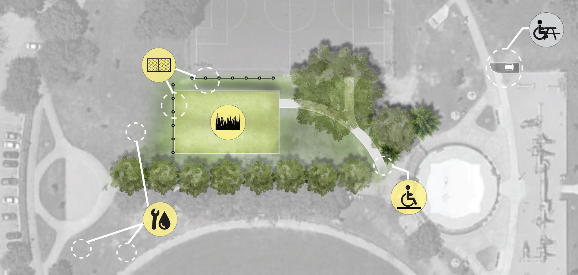
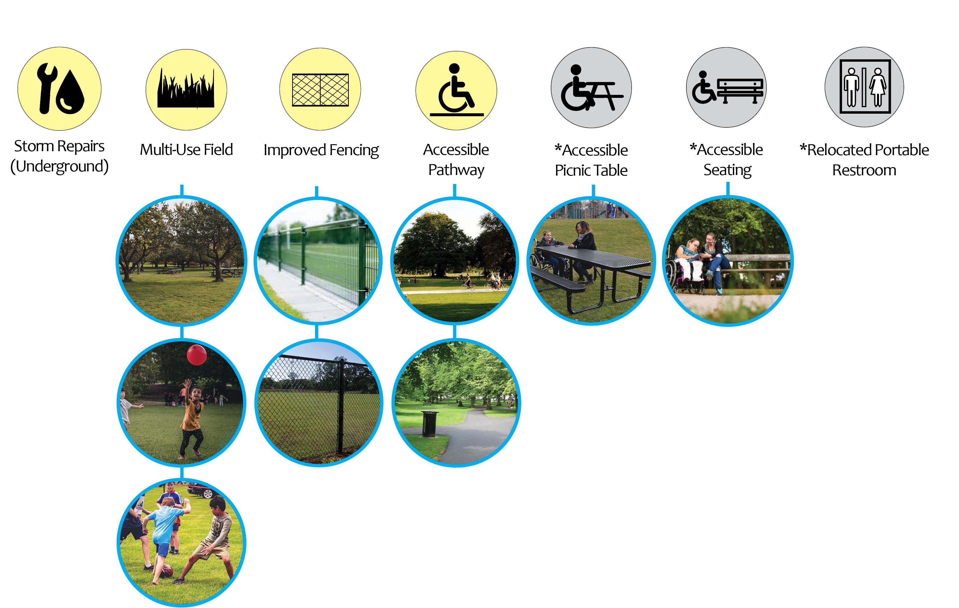
Recently when creating the concept plan for site improvements at a Minneapolis park (right), we used a simple, contrasting color palette overlaid with textures to help represent key project details. Beyond considerations to color, texture, and size, we aimed to create a graphic that would be legible to community members who speak/read English as a second language, relying on icons and color to convey the improvements without text.
We are excited to share our progress as we continue to build our resources for visual accessibility, promoting legibility and utility across our company. As we continue to explore additional tools for navigating our website and resources, we hope that you will share your thoughts and feedback with us!
What to know about creating graphics for individuals with visual impairments and color-blindness:
- There are three categories of and seven types of color blindness:
- Red-green (Deuteranomaly, Protanomaly, Protanopia and Deuteranopia) makes distinguishing between red and green difficult.
- Blue-yellow Color Blindness (Tritanomaly and Tritanopia) makes it difficult to tell the difference between blues and greens, and between yellows and reds.
- Complete color blindness is the condition where someone cannot see color at all and sees in a spectrum of greys.
- Some color blindness can be corrected with prescription glasses, contacts, or other visual aids like phone, tablet, or computer applications to help with color differentiation. While color blindness effects all individuals differently, it most commonly impacts three areas:
- Makes it hard to distinguish the difference between colors
- Effects the brightness or vibrance of colors
- Makes telling difference between shades of colors difficult
- When creating content there are a few basic principles that can be followed to promote visual equity:
- Provide more space between lines of text
- Reduce visual clutter
- Clear labels that are large enough to read
- Contrast between text and background (i.e. avoid colors that could appear the same to someone who is visually impaired, like red and green or yellows and reds.)
- Utilize patterns or textures to differentiate between colors